Last week I watched a cute movie on HBO. First Daughter with Katie Holmes, Michael Keaton and Marc Blucas. I'd highly recommend for a good romantic flick. Despite her poor taste in men, I have a soft spot for Katie Holmes from my Dawson's Creek days. I also really like Marc Blucas from playing Riley on Buffy the Vampire Slayer.
I'm sad to report that Gregg Marshall, basketball coach for my alma mater, Winthrop University has resigned! He'll be starting the next school year with College of Charleston. Sounds like a good move for him and his family but it stinks for our little community that had gotten used to Winthrop going to the Big Dance. Spencer is attending his basketball camp again this year and I'm not sure if the Coach will be personally involved like he was in year's past...fingers crossed.
We have had a tremendous amount of rain in the last week or so. Today has been pretty sunny though and it seems we are in the clear for the next few days. Some of the rain has been a bit too much but my flowers & plants seem to be happy!
6.23.2006
Bake Sale (Dalton Help Foundation)
Friends of ours have an autistic son & have started a foundation to benefit him and other autistic children in our area (Dalton Help Foundation). They held their first large fundraiser in April (golf tournament) and asked me to take pictures of the event and do a scrapbook. I was flattered & honored, and of course accepted.
So, I'm going to do an ongoing scrapbook of anything related to the foundation. This is a bake sale at a local school that was around the same time as the golf tournament. I don' t know these children personally so I've blurred their faces and names.
For the album, I've decided to use all black backgrounds, for both consistency and simplicity. The symbol for autism is the puzzle piece so I also decided to include at least one on each layout. I bought a children's puzzle and will paint the pieces to match each layout.
I'm kind of using this as an opportunity to use up some old scraps and supplies. I'm keeping it simple for time's sake as well. So, these layouts aren't exactly my current style.
6.22.2006
Blog Challenge
This was a Blog Challenge at Scrappin' Fun:
1. FIRST NAME? Holly
2. WERE YOU NAMED AFTER ANYONE? Not my first name. My middle name is Lee which is the same as my two older sisters. I've never met anyone else whose family gave all the siblings the same middle name.
3. WHEN DID YOU LAST CRY? Hmmm....I do not remember. I guess that's a good thing.
4. DO YOU LIKE YOUR HANDWRITING? Most of the time, I do. But if I get in a hurry, it's chicken scratch.
5. WHAT IS YOUR FAVORITE LUNCH MEAT? Bologna
6. DO YOU HAVE KIDS? None of my own, but I have a 7 year old stepson
7. IF YOU WERE ANOTHER PERSON, WOULD YOU BE FRIENDS WITH YOU? Gosh, I hope so!
8. DO YOU HAVE A JOURNAL? No, not really.
9. DO YOU USE SARCASM A LOT? YES! I am incredibly sarcastic.
10. DO YOU STILL HAVE YOUR TONSILS? Let me check... yup, still there.
11. WOULD YOU BUNGEE JUMP? NO WAY!
What happened to #12???
13. DO YOU UNTIE YOUR SHOES WHEN YOU TAKE THEM OFF? No.
14. DO YOU THINK YOU ARE STRONG? Physically? No. Emotionally? Most of the time.
15. WHAT IS YOUR FAVORITE ICE CREAM FLAVOR? Chocolate!
16. SHOE SIZE? 6 1/2
17. RED OR PINK? PINK :)
18. WHAT IS YOUR LEAST FAVORITE THING ABOUT YOURSELF? I have to just pick one??? Right now, probably my weight.
19. WHO DO YOU MISS THE MOST? Right now, my dad...seems like I don't see or talk to him as much as I used to.
20. WHEN AND WHERE WERE YOU BORN? July 11 - Shelby, NC
21. WHAT COLOR PANTS AND SHOES ARE YOU WEARING? Pants are a Tannish brown (dark khaki) and shoes are two shades of brown (camel and chocolate).
22. WHAT IS THE LAST THING YOU ATE? I'm currently eating lunch - chicken salad sandwich with a side of fruit.
23. WHAT ARE YOU LISTENING TO RIGHT NOW? Boring office noises... people talking, phones ringing, keyboard clicking...there are also some construction noises across the street.
24 IF YOU WERE A CRAYON, WHAT COLOR WOULD YOU BE? Burnt Sienna
25. FAVORITE SMELL? Cinnamon Spice or Eucalyptus
26. WHO WAS THE LAST PERSON YOU TALKED WITH ON THE PHONE? A guy named Rob at work.
27. THE FIRST THING YOU NOTICE ABOUT PEOPLE YOU MEET? The firmness of their handshake.
28. DO YOU HAVE A SPECIAL TALENT?. I don't know. I'm kind of creative, but not sure if it's a "special talent". I'm a pretty good analyst (my job). I am great at organizing...
29. FAVORITE DRINK? Favorite beer is Corona Light; Favorite Cocktail is Cosmopolitan; Favorite hot drink is a spiced tea of some sort; Favorite soft drink is Vanilla Coke (which is incredibly hard to find now). Favorite *special* drink is Blenheim Ginger Ale. I love drinks :)
30. FAVORITE SPORT? Football (more specifically - USC Gamecocks College Football)
31. HAIR COLOR? Blonde. Naturally I'm a bit darker but I have it highlighted to keep it light since I don't get to play out in the sun all day like I did when I was younger!
32. EYE COLOR? Blue
33. DO YOU WEAR CONTACTS? Yes. I'm blind as a bat!
34. FAVORITE FOOD? Mexican - cheese enchilada, beef hard taco and a side of rice (with cheese dip as an appetizer)
35. SCARY MOVIES OR HAPPY ENDING? I like both, but I'd go with happy ending because I love romantic comedies (and it RUINS a good, romantic movie if there is not a happy ending).
36. LAST MOVIE YOU WATCHED? Hide and Seek (Robert Di Nero and Dakota Fanning)
37. WHAT COLOR SHIRT ARE YOU WEARING? Blue
38. SUMMER OR WINTER? Summer, DEFINITELY. I hate cold.
39. HUGS OR KISSES? Can't I have both???
40. FAVORITE DESSERT? Strawberry Shortcake
41. WHAT BOOKS ARE YOU READING? London Bridges by James Patterson
42. WHAT'S ON YOUR MOUSE PAD? Doodles. It's solid blue and I tend to doodle on it if I get stuck on hold or something while on the phone.
43. FAVORITE SOUNDS? Music. (good music.)
44. ROLLING STONES OR BEATLES? Neither, but if I had to pick, I'd take the Beatles
45. THE FURTHEST YOU'VE BEEN FROM HOME San Francisco, CA
46. IF YOU COULD PICK ANY TWO PEOPLE TO HAVE DINNER WITH, WHO WOULD THEY BE? Assuming they don't have to be alive: Ronald Reagan and Michael Jordan
6.19.2006
Movies
As is the case with most men, Matt is not a big fan of romantic comedies. Last week I decided to take advantage to his working nights right now. I rented two girly movies, chick flicks, call them what you want... I would recommend both.
Rumor Has It with Jennifer Aniston and Kevin Costner. This was funny - probably more funny than romantic. Of the 2, this would be the more tolerable for the male species to sit through.
Just Like Heaven with Reese Witherspoon. This was more of a romantic comedy, as I define them. I loved it. It had a little twist so it wasn't the same ole, same ole. Plus, I love Reese Witherspoon.
PS - I just realized that Mark Ruffalo was in both of these movies...I watched these movies within a day of each other and didn't realize it when I watched them! Too funny! Well, at least it'll be helpful if I ever play the Kevin Bacon game again and need to link Jennifer Aniston and Reese Witherspoon!
Last week I also saw a scary movie coming on HBO that we had not seen. I was NOT about to watch it alone while Matt was at work. So, I DVR'd it and we watched it last night. It was very good and again, I'd highly recommend. It was called Hide and Seek with Dakota Fanning and Robert De Niro.
PS - can you tell it's rerun season...
6.18.2006
Portulaca
These are flowers I planted in a pot in front of our garage. They are called "Portulaca". I planted them about a month ago. They were doing OK but nothing spectacular. A few days ago we had some horrendous rain and ever since then, they've looked amazing. So, I don't know if it's a timing thing and they just tend to bloom around this time, or if they just enjoyed the downpours that much!
4th of July decorations

I don't decorate much for the 4th of July, but I did pick up these few items this year (at Hobby Lobby). It's just a decorative plate, candle holder and small dish (which holds jelly beans). I also made a bow which I attached to the flower pot hanging on the front door. As of right now, that's all I've got.
Bathroom
This is our 1/2 bathroom downstairs. I painted this room myself and it was quite an ordeal. I started with a bright cobalt blue and was planning on a faux texture technique. To make a long story short... it was a disaster and I ended up starting from scratch with this color. The good news is that after many, many hours of work and about $100 in supplies...I like how the bathroom looks!
 This room is done in a South Carolina theme. The palmetto tree and crescent moon motif is on our state flag. The black mirror holds a tea light candle. The candle on the back of the toilet smells SO good!
 The pedestal sink and mirror came with the house. We purchased this hand towel at our state capital's gift shop.
 This is my favorite part of the bathroom. When we visited our state capital back in March, I took a ton of pictures. I printed my favorites and framed them for this photo collage.
Dining Room
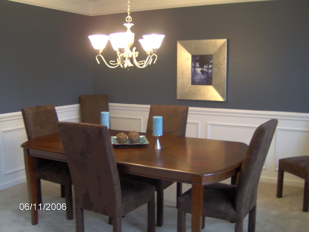
The picture is a little blurry but this is the dining room. Everything in here is new because we didn't have a dining room in our old house. The wall color is called "outerspace".
Foyer

This is a view of the foyer from the hallway that leads to the main living area. The blue paint is carried through from the dining room because there is no "break". Then the Latte paint is used above the door and carried through the downstairs and upstairs hallways. We have one of those "shelf" things above the door so we need some very large decorative items up there...so far we haven't had any luck finding something we like.
6.16.2006
Kitchen
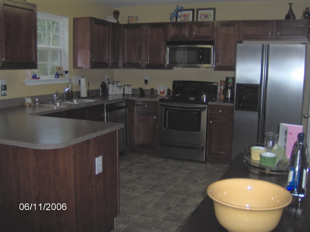 This is a photo of the actual kitchen. I apologize for it being so dark.
I knew I wanted dark cabinets long before we chose a house. I just love dark wood for some reason. We got all new appliances and chose stainless steel. Our old kitchen was much smaller so I love all the space in here. It's nice to actually have a few empty cabinets!
Our old kitchen was done in a southwestern theme. It was a bit harder to do that in this house because everything is so open. I kept most of my decor items and placed them above the cabinets. The theme just isn't as "obvious".
Kitchen & Breakfast Nook
The kitchen, breakfast nook and hallway leading to the dining room are all painted "Restrained Gold". I like bold colors, but we chose a softer yellow so that it would blend well with the other colors. Because our floor plan is so open, we had to be cautious with colors - it could easily be overwhelming on the eye. The kitchen in our old house was practically orange :)
 This is the breakfast nook, right off the den. Of these photos, this one captures the wall color the best. We had this furniture in the old house as well. The table is counterheight and I LOVE it. I bought the placemats while we were "homeless" and used those as a guide for the wall color (hey, you gotta get inspiration from somewhere!).
On the far left of the photo you can see where the yellow of the kitchen and the brown of the den meet...they are different colors but very similar - same tonal value.

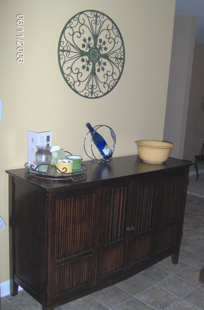
This is the other area of the breakfast nook. This is all new. The buffett we purchased at Pier 1. It holds our wine, liquor, party glasses (lots of hand-me-downs from my in-laws). The yellow bowl is also from Pier 1 and usually is full of fruit. The tray was a gift from our realtor and I use it to hold whatever floats my boat at the moment. I love the extra storage this piece allows, and it serves as a great bar when we have guests over. The wall art we got from Garden Ridge. I was hoping for something larger, but this was the best I could find. I'm not sure if you can tell in the photo but it's green.
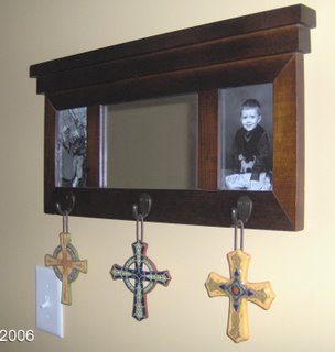
This is hanging in the hallway between the kitchen and dining room. During holidays, I've been purchasing three hanging decorative items to hang here (so far I have St. Patrick's Day and Easter). While we were in the mountains I saw these crosses and fell in love with them. I will keep them hanging year round when I don't have anything seasonal to hang. I found them in Valle Crucis ("Valley of the Cross"), appropriate, huh?
 This is the breakfast nook, right off the den. Of these photos, this one captures the wall color the best. We had this furniture in the old house as well. The table is counterheight and I LOVE it. I bought the placemats while we were "homeless" and used those as a guide for the wall color (hey, you gotta get inspiration from somewhere!).
 On the far left of the photo you can see where the yellow of the kitchen and the brown of the den meet...they are different colors but very similar - same tonal value.
This is the other area of the breakfast nook. This is all new. The buffett we purchased at Pier 1. It holds our wine, liquor, party glasses (lots of hand-me-downs from my in-laws). The yellow bowl is also from Pier 1 and usually is full of fruit. The tray was a gift from our realtor and I use it to hold whatever floats my boat at the moment. I love the extra storage this piece allows, and it serves as a great bar when we have guests over. The wall art we got from Garden Ridge. I was hoping for something larger, but this was the best I could find. I'm not sure if you can tell in the photo but it's green.
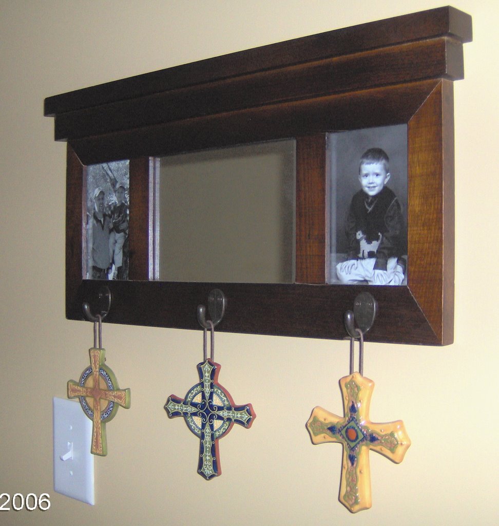
This is hanging in the hallway between the kitchen and dining room. During holidays, I've been purchasing three hanging decorative items to hang here (so far I have St. Patrick's Day and Easter). While we were in the mountains I saw these crosses and fell in love with them. I will keep them hanging year round when I don't have anything seasonal to hang. I found them in Valle Crucis ("Valley of the Cross"), appropriate, huh?
Den
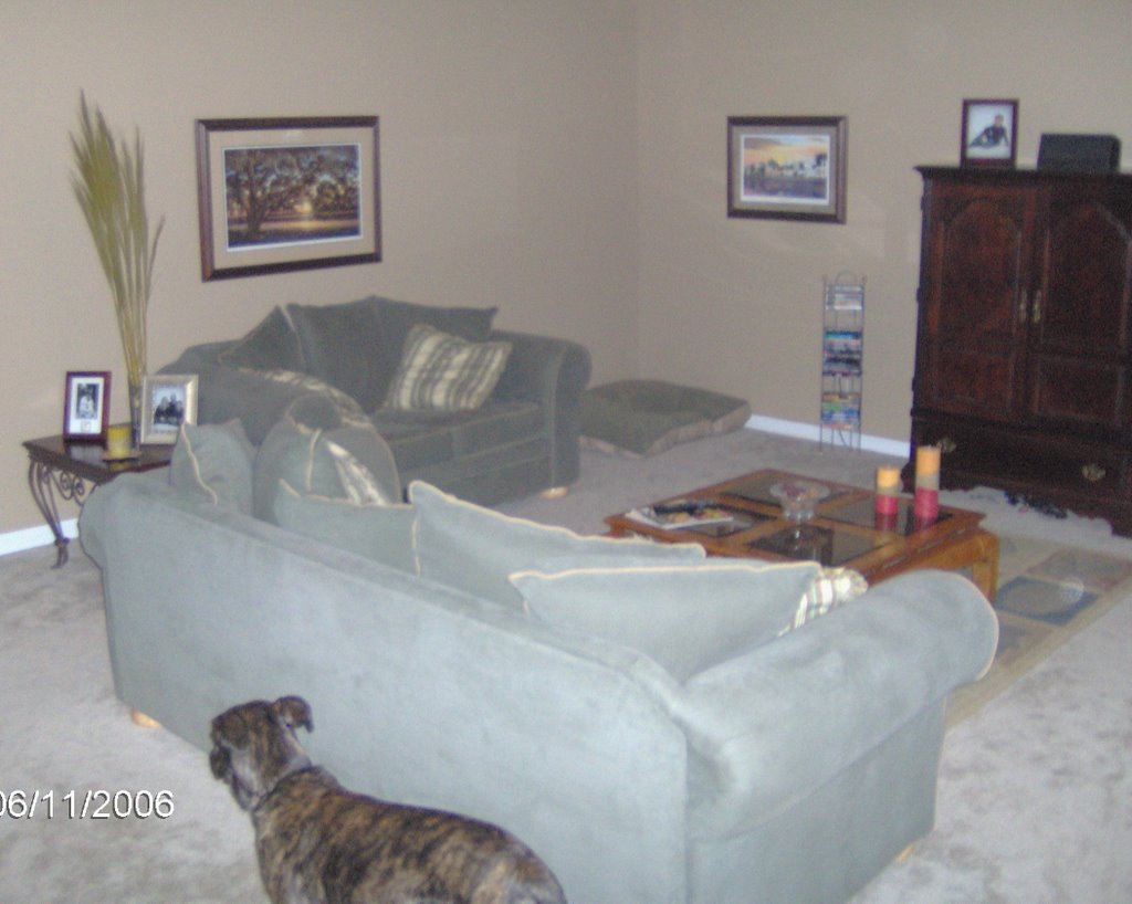

I have been promising pictures of the new house in more detail and have been very slack...so here are some more. One reason it's taken so long is because I've tried several times and the pictures either come out blurry or the colors are all messed up. I'm giving up and posting what I've got!
Here is the den. The main living portion of our house is very open (the den, breakfast nook and kitchen), which I love! The den is sunken so you have to take 2 steps down, which I also like.
The walls of this room are painted "Latte" which kind of a khaki brown. The furniture in this room is all stuff we already had. The only new things are the three wood-framed pictures on the walls. I really don't feel like these photos do this room justice. But, oh well!
(As you can see, Rio felt it was necessary to be included in each picture).
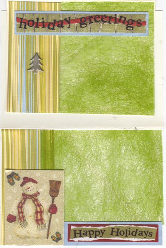
Six More Cards
I've been trying to make cards with scraps after I finish a layout and I have out all the coordinating products and supplies. However, after doing this several times, I was starting to wonder if I was making more cards than I'd actually use. Then, I looked at the paper with a tilted head and thought "I can make this Christmasy". So, I made two generic cards and then 6 Christmas cards. I never send handmade Christmas cards because I don't have time. So, now I will pay more attention to my "scraps" and see if I can use it for holiday cards!


Don't Throw That Away
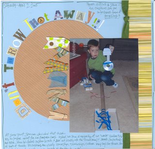
This is probably the closest I've ever gotten to a Freestyle layout. I thought a messy look would work since the basis of the layout is trash! I used random letter stickers and scraps of ribbon combined with my own handwriting.
Supplies:
Patterned paper: Scrapworks (Ethan Kate line)
Misc. ribbons
Staples
Misc. letter stickers
“Hunter Green” Zig Writer
Journaling:
At some point, Spencer decided that trash was no longer meant for our trash cans. Instead, we save a majority of our ‘waste’ under his art table. When he’s feeling creative he pulls it ALL out (usually into the living room) and starts concocting all sorts of things. His creations are usually spaceships, battleships, and other boy-like things. He loves that I work for an adhesives company - he gets all the tape he wants!
Written at top right: Though the collections are hard to store, it’s an intriguing form of recycling.
Earth Day - Museum
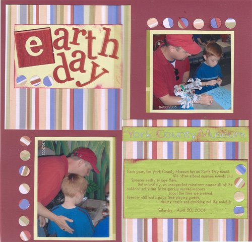 I did this layout last night & this morning. I am not terribly thrilled with the results, but at least it's done. Only 40 million to go, right??? Photos are from a visit to our local museum's Earth Day event last year.
 Supplies:
Patterned paper: Daisy D’s
Rub-on letters: Kopp Design
Die-cut letters: Me & My Big Ideas
“Burgundy” ink pad: Rubber Stampede
Journaling font: 2Peas RagTag
Hole punch: EK Success
6.14.2006
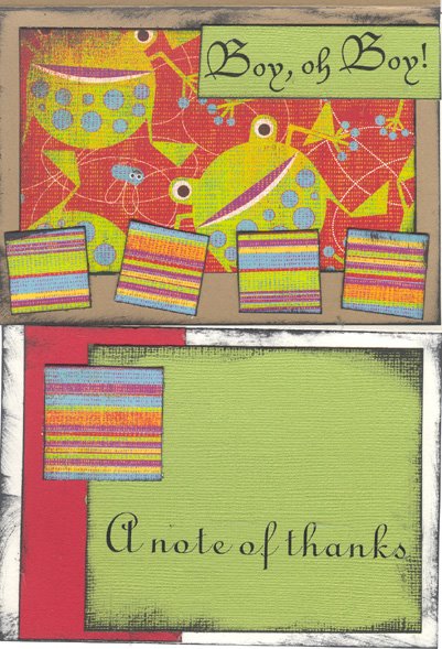
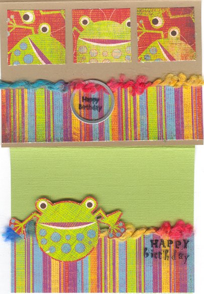
Lots of Coordinating Cards
Sunday, when I created the "Come See Me" layout, I created 8 cards with the leftover supplies. I LOVE these patterned papers so it was kind of fun to be able to get so much out of them. One of them is for my husband for Father's Day but the rest are just extras to have on hand. I have a pretty decent size stash now.


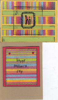
The basic supplies on all the cards are Color Me Silly paper by Basic Grey ("Giggles" is the frog and "Spirit" is the stripe). I used "Jet Black" Staz On ink on almost every card. The sentiment rub-ons are Miss Elizabeth's from the Dollar Tree. I used a transparency on a few with some stamps (Hero Arts makes the stitch and alphabet stamps; I bought the "hi" stamp for $1 at Michael's). Clear tag is Jest Charming. Sentiment Eyelet is Making Memories. Then some miscellaneous stuff like the fibers and red brads.


6.12.2006
Come See Me layout
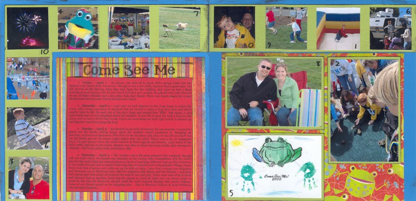
I created this layout based on the December 2006 Becky Higgins Sketch. I kept very true to the sketch, almost identical (which is very unusual for me). I love how I was able to include so many photos.
This event is actually a 10-day festival in our town, so I used number stickers to help connect the journaling with the relevant photos. Our town and festival mascot is a frog, thus the frog paper. The title was printed on a transparency, heat embossed, and stapled to the top of the journaling block.
SUPPLIES:
Patterned paper: “Giggle” & “Spirit”, Color Me Silly, Basic Grey
Number stickers: “Playtime Headliner”, Miss Elizabeth’s
Ink pad: “Jet Black”, Staz On
Title font: “SP Upper West Side”
Journaling Font: “Georgia”
Transparency: Staples
Green staples
Clear embossing powder: Stampendous
6.10.2006
Our Christmas
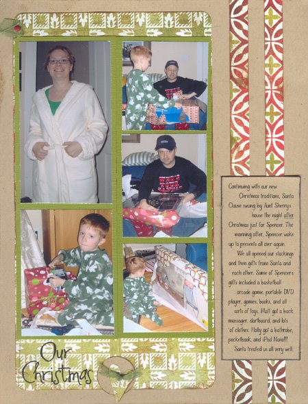 This layout was created for me by Jill at Scrappin’ Fun. This will go into my Christmas album, obviously. This page, however, wasn’t quite as easy to put together as the rest…but it was my fault.
Apparently I didn’t have my brain turned on at some point during this swap. I accidentally told Jill and Dianne to make a layout for the same set of pictures. OOPS! Well, I had already printed the photos to size for Dianne’s layout by the time I realized how brilliant I’d been. Thankfully, Jill’s gorgeous layout was incredibly easy to adapt to another set of Christmas photos.
Instead of doing Christmas Eve photos, I used pictures from Christmas Morning. She included the super cute accent unattached, so I strategically placed it over the word “eve” in the title (aren’t I clever?). I printed 5 pictures in a small format. The only thing I don’t like is that I had to cover up some really gorgeous patterned paper! I was able to print my journaling on the back of the journaling block she’d sent along, so the paper matches perfectly.
Keeping Traditions Alive

This layout was created for me by Dianne at Scrappin’ Fun. It will be added to my Christmas Album. I just adore the look of this. I have TONS of Christmas patterned paper but I don’t have this one! The accents are adorable and I really like the title placement.
Gingerbread House

This layout was made for me by Dianne at Scrappin’ Fun. I just adore it. This will go in my Christmas Album. The patterned paper is super cute and I really love the clear monogram block. I even like the detail of having the journaling kind of zig-zag! I felt guilty just adding a picture and sticking it in my album!!!! The only thing I added was the year (then realized it’s very obvious by the photo’s date stamp, but oh well). I decided to lower the color saturation on this photo before printing because Spencer was wearing an obnoxiously bright yellow sweatshirt.
Yearbook Staff
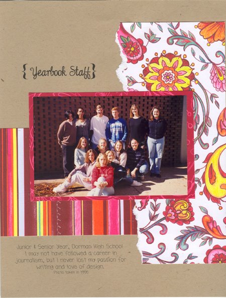
This layout was made for me by Jill at Scrappin’ Fun in a swap. This will be added to my “Book of Me”. I was originally planning to convert this photo to black & white upon receiving the swap pages. However, she did an amazing job with the colors and I was pleased with how it looked without editing!!! (I’m in the 2nd row at the bottom, sitting on the right side). I also have a newspaper article from when our yearbook staff was featured. I created a pocket on the back of the layout to hold it.
Cozy Cats

This layout was made for me by Tammy at Scrappin’ Fun. It will also be added to my Book of Me album. I love the homey feel of this layout and how it brings across the warm, cuddly feeling I get when I see the two cats cuddled together on the couch. The journaling on a transparency is perfect to allow that gorgeous pattern to show through. The flower is the perfect finishing touch!!
Bogey
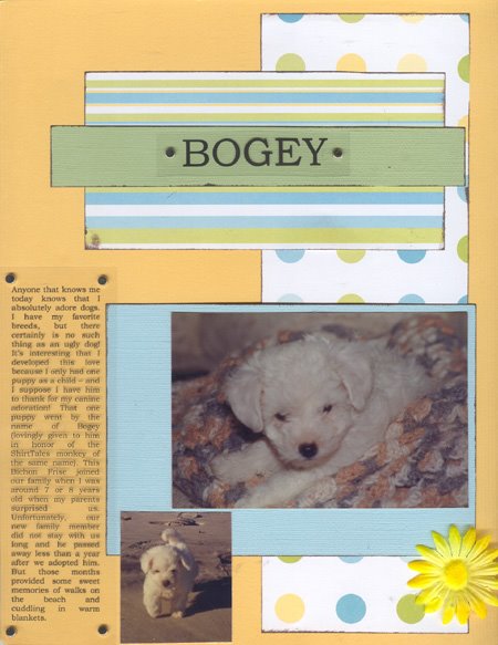
This layout was made for me by Tammy at Scrappin’ Fun. It will be added to my “Book of Me” album (it's about a childhood dog). I just love everything about this layout. I really love the title and journaling on the transparency. The soft colors are ideal for these sweet pictures of soft and cuddly Bogey. Originally, I was only going to use the one photo, but after having everything in front of me, I cropped down the photo of him on the beach and stuck it in there.
Stage Fright
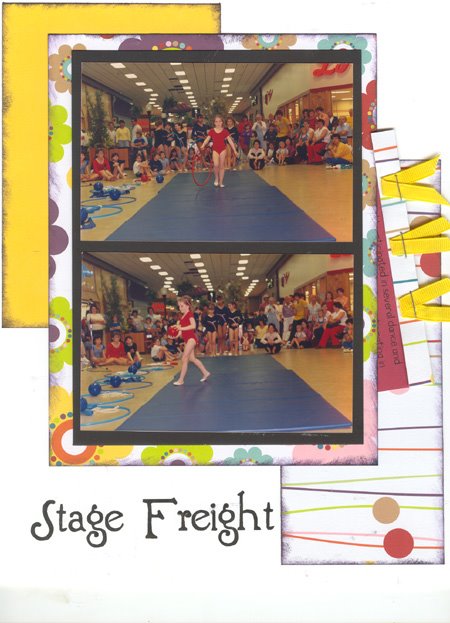
This is another layout made for me by Melissa at Scrappin’ Fun. It will be added to my “Book of Me”. All I had to do was slap the 2 photos down on this and I was all done. The bright, fun papers are perfect for these pictures. I just adore the hidden journaling (which I pulled out a tad so it could be seen in the scan). Thanks Melissa!
6.09.2006
Pop-Pop
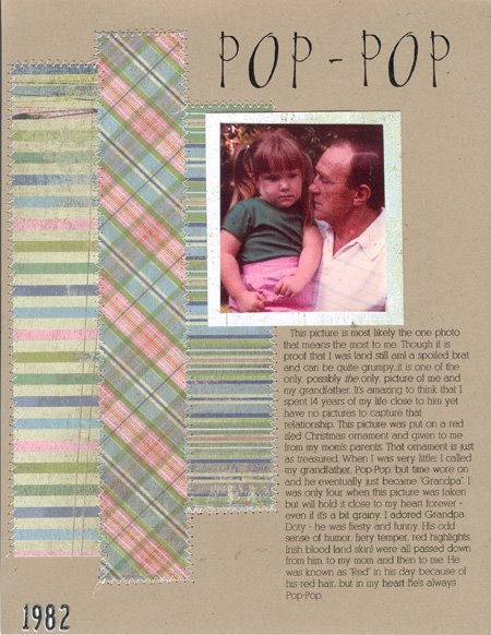
This layout was made for me by Melissa at Scrappin’ Fun in a swap. It will be added to my “Book of Me”. Thank you, Melissa, for making such a gorgeous layout for this special picture of me and my grandfather. I love the combination of patterned papers and they work well with the old photo. Even more, I love the stitching because it’s something I can’t do on my own layouts! All I had to do was slap the photo on this page and ALL DONE! What an amazing feeling. (And yes that’s me in the picture – chubby and grumpy!)
6.06.2006
June Challenge - Scrappin' Fun
The challenge was to get back to the basics of scrapping. We were allowed to use patterned paper & cardstock. Nothing could be computer-generated. No store bought accents or embellishments allowed. Chalks, inks, pens, pencils, stamps and stencils were OK.
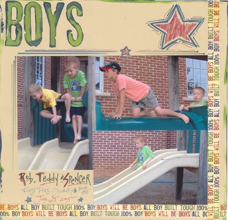
So, here is what I came up with. It was actually a LOT of fun. I also tried my hand at doodling for the first time on a layout. I had to keep it simple though. I didn't want to get too girly since this is a very boyish layout!

Supplies:
Patterned Paper: “Boys to Men”, Bo Bunny Press
Alphabet foam stamps: “Jersey”, Making Memories
Pens: “Antique Burgundy” and “Denim”, Zig Writer; “Colonial Green”, Highsmith
Acrylic paint: “Midnight Blue” and “Leaf Green”, Plaid
So, here is what I came up with. It was actually a LOT of fun. I also tried my hand at doodling for the first time on a layout. I had to keep it simple though. I didn't want to get too girly since this is a very boyish layout!
Supplies:
Patterned Paper: “Boys to Men”, Bo Bunny Press
Alphabet foam stamps: “Jersey”, Making Memories
Pens: “Antique Burgundy” and “Denim”, Zig Writer; “Colonial Green”, Highsmith
Acrylic paint: “Midnight Blue” and “Leaf Green”, Plaid
June Sketch Challenge at Scrappin' Fun
Here's the sketch:
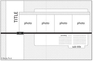
Here's my version:

SUPPLIES:
Patterned Paper: “India Ink”, Basic Grey (background); Sports Solution (Gamecock pattern); “Romance Stripe”, Junkitz (stripe)
“Jet Black” ink pad: StazOn
Journaling Font: Gloucester MT Extra Condensed
Burgundy and black fiber: unknown
Gamecock border sticker: Sports Solution
Football charm: Lil’ Charms, American Traditional Designs
Dymo label
Tab: Heidi Swap
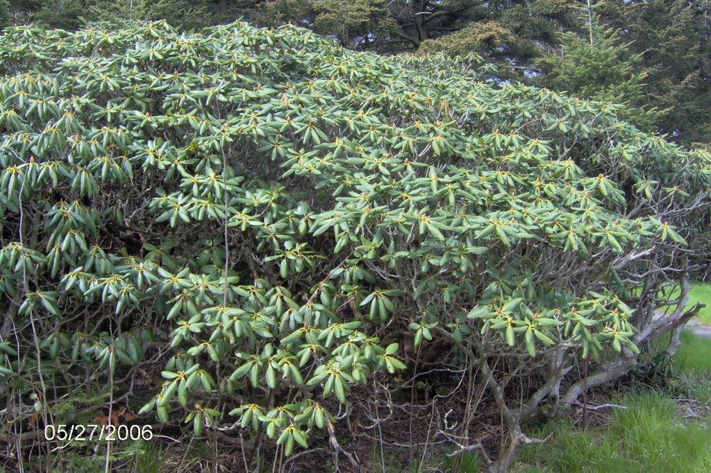
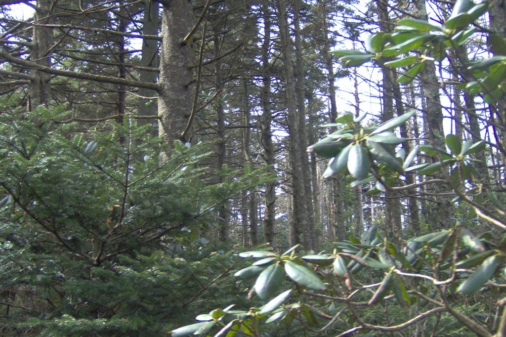
Roan Mountain - Gardens????
OK, every good vacation has to have one big mistake...right? Well, this was ours. We had this wonderful brochure advertising the gorgeous Rhododendron Gardens at the top of Roan Mountain. It said peak blooming time was the 3rd week in June. We were close (end of May) and there were these flowers in bloom everywhere we'd been in the mountains. So, we asked and found out it was about a 30 minute drive so we decided to give it a whirl...not a good idea.
We found our own way there using a map we had in the car (there was no "easy" way unfortunately). It took at LEAST an hour to get there. Turns out Roan Mountain is pretty high up and it was COLD there...and the flowers were not anywhere near ready to bloom! OOPS!
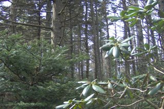
I was disappointed because I wanted to see the flowers but Matt and Spencer seemed to kind of enjoy themselves. I think Spencer was excited just to be able to run around and stretch his legs. Matt liked the look of the spooky gardens. They honestly looked like something out of a scary kids storybook - like where a witch would live or something. These pictures don't even do them justice because it was much darker in real life. Plus, you could have easily gotten lost! The pictures aren't much to look at but I had to take them so I could tell this story.

We found our own way there using a map we had in the car (there was no "easy" way unfortunately). It took at LEAST an hour to get there. Turns out Roan Mountain is pretty high up and it was COLD there...and the flowers were not anywhere near ready to bloom! OOPS!
I was disappointed because I wanted to see the flowers but Matt and Spencer seemed to kind of enjoy themselves. I think Spencer was excited just to be able to run around and stretch his legs. Matt liked the look of the spooky gardens. They honestly looked like something out of a scary kids storybook - like where a witch would live or something. These pictures don't even do them justice because it was much darker in real life. Plus, you could have easily gotten lost! The pictures aren't much to look at but I had to take them so I could tell this story.

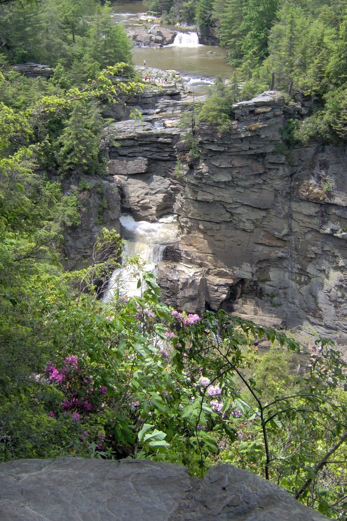
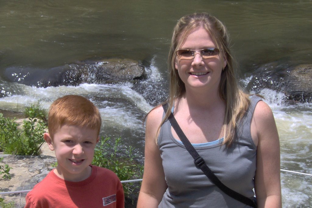
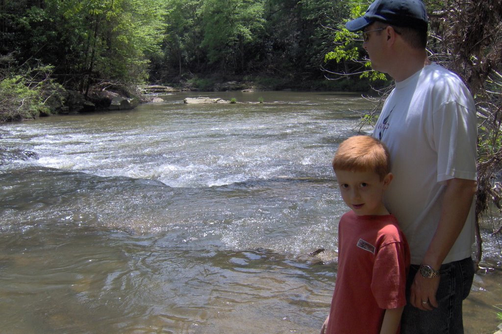
Linville Falls - People
On Saturday of our mountain trip, we went to Linville Falls. There you can hike up to various lookout points to see the beautiful waterfalls. Spencer was actually "bored" because the trail wasn't all rocky and bumpy like the one at Grandfather Mountain. But it was longer, so he did get tired in the end! Here are pictures of Spencer with both me and Matt in front of the river.


Gem Mining
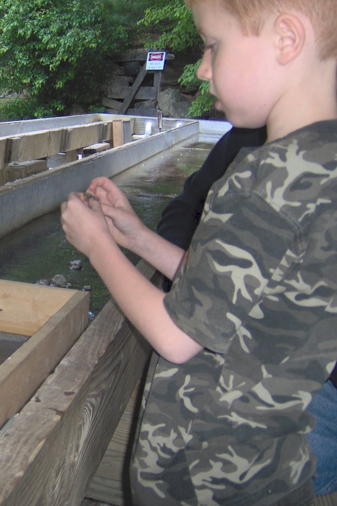
The ONE thing that Spencer insists we do each and every time we go to the mountains is Gem Mining. I think we have tried every place in the area near where we stay. So, here he is...checking out his latest finds. He has a rock collection that weighs more than I do!
View from the Top
When we go to the mountains, we stay at a condo at the very top of Sugar Mountain (creatively named "SugarTop"). Spencer took these pictures with my camera from our balcony. It was sunset but we are on the side of the building where we don't actually see the sun setting. He also took some pictures on his camera but he's only about 1/2 way done with the roll. It'll be interesting to see what's on there because he took pictures of a 2-story Wendy's in Boone because he said "Now, that's something you don't see everyday". LOL!


6.05.2006
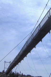
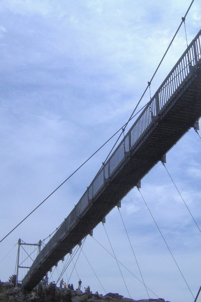
Grandfather Mountain - Swinging Bridge
These are the last pictures of Grandfather Mountain - I promise! The main "attraction" there is the Mile High Swinging Bridge. It's a mile above sea level. This is the actual bridge (taken from the hike that goes under it). Matt is terrified of heights so he wouldn't go near the thing. Spencer, on the other hand, is a constant thrill-seeker. So, he and I braved the bridge together.
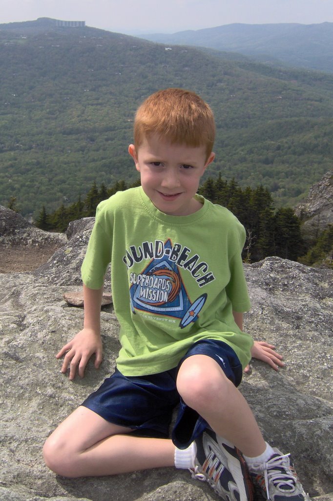
This is Spencer on the other side of the bridge, after having crossed it - proof that he made it across in case there is ever any doubt!
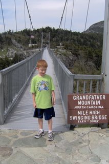
This is also Spencer at the top of Grandfather Mountain, on the other side of the bridge. Do you see the building on the top of the mountain in the background??? That's where we stay.
Grandfather Mountain - Hike
While at Grandfather Mountain, we took a short hike. You park at a certain area and can hike the mountain up under, and eventually to, the swinging bridge. It was only about a mile total but the path was very rocky. Spencer had a blast! It was a fun little walk.
Here is Matt taking a little rest (we are all so out of shape!)

Matt and Spencer at the bottom of some stairs that led to a view. Behind them there is a small chapel in the middle of the woods - thought that was interesting.

Spencer and Matt hiking on up....

I took this close-up on our hike. Isn't it beautiful?

Subscribe to:
Posts (Atom)


