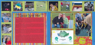
I created this layout based on the December 2006 Becky Higgins Sketch. I kept very true to the sketch, almost identical (which is very unusual for me). I love how I was able to include so many photos.
This event is actually a 10-day festival in our town, so I used number stickers to help connect the journaling with the relevant photos. Our town and festival mascot is a frog, thus the frog paper. The title was printed on a transparency, heat embossed, and stapled to the top of the journaling block.
SUPPLIES:
Patterned paper: “Giggle” & “Spirit”, Color Me Silly, Basic Grey
Number stickers: “Playtime Headliner”, Miss Elizabeth’s
Ink pad: “Jet Black”, Staz On
Title font: “SP Upper West Side”
Journaling Font: “Georgia”
Transparency: Staples
Green staples
Clear embossing powder: Stampendous


Great use of the sketch Holly! Love all the photos!! Hope you are submitting it!!
ReplyDeleteI love this LO. It looks totally like one you would see in a magazine. I also love that you got so many photos on it. Great job!!
ReplyDelete