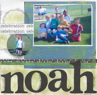
As a challenge, I had to scraplift a specific layout. I definitely veered off on my own path, but I think it's still obvious that I borrowed some ideas. Here are the concepts I used from the other layout:
- white background
- enlarged photo (original was vertical orientation, though)
- Circles
- large, bold title
- strips across the page
- bright color against the white background
Supplies:
Patterned Paper - Rusty Pickle, Outdoors & More, and Diecuts with a View
Circle punch - Marvy
Ink pads - "Jet Black", Staz On; "Tart Lime", Ink It Up
Ribbon - American Crafts
(Letters were traced using a Basic Grey alphabet)


No comments:
Post a Comment