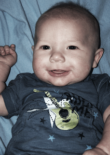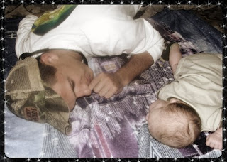
Our Project 2 assignment was to combine all of the things that we learned in the first three lessons. This photo includes a black frame, brushes (the small starbursts), and the vintage photo effect.

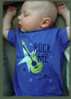
This is from Lesson 4 which was learning to use a mask. It is my understanding that these are similar to frames but kind of work in the opposite way. Kind of hard to explain. I was proud of myself because the lesson only had us using a white background (which creates a white mask, or border). I didn't want white so I was able to figure out how to change the color. It's wasn't very hard, but since my Photoshop knowledge is limited, I'm still proud :)


No comments:
Post a Comment